On average, about 70% of website visitors leave without buying. If you have ever wondered "why people leave my website quickly", the reason is not that they don't like the product or service; rather, it's not the only reason.
Customers leave your online store after adding to cart a product for various reasons. Here are some of them:
- how difficult it is to find a branded resource;
- what value it represents to the customer;
- how to navigate a digital resource;
- types of communication with business representatives;
- site content and relevance of information;
- optimization and adaptability of the web resource;
- monetization ways.
The above applies to marketing, technical implementation of the resource, as well as to UX. We will discuss the latter in this article because it determines how easy it is to interact with the site. It affects whether the user makes a purchase or leaves.
We offer a detailed analysis of each problem, its impact on profits, and solution methods.
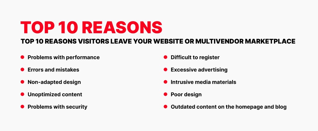
1. Problems with performance

The development of digital and electronic technologies has become a catalyst for the emergence of high-performance devices. First, it concerns smartphones, which account for almost 60% of the world's web traffic. Progress has also touched less common devices, for example, tablets, laptops, and PCs. Their share of the market is about 39%.
With dozens of gigabytes of RAM, powerful multicore processors, and high-performance graphics chips, such devices cannot run slowly. The same cannot be said for digital resources.
In 2018, Google experts said the average mobile page load takes about 15.3s. A MachMetrics study conducted in 2020 showed that most sites have a load time of about 5-11 seconds, with people leaving your website in 3 seconds. How much do you think this value changed in 2024? The average website load time in 2024 is reported to be 3.21 seconds. This is an acceptable web page response time. Still, people leave slow-loading websites. A substantial 83% of internet users anticipate that websites will load within three seconds or less, and approximately 40% will abandon a site that takes longer than this.
Technological trends, as well as UX trends, dictate new rules and quality standards for digital resources. First and foremost, this applies to the speed of websites, web apps, and mobile business apps. Marketplace website loading speed is important too.
The speed parameter can be roughly divided into three types:
- speed of loading pages on websites and content in apps;
- the overall speed of navigation and responsiveness of the interface, page speed optimization;
- speed of query processing.
And each of these characteristics affects whether or not visitors are leaving a website.
Focusing on the first parameter, we can note that it directly affects online marketplace growth and conversion rate. A website that loads in 1 second can achieve a conversion rate (CR) that is three times higher than that of a site that loads in 5 seconds. The disparity becomes even more significant when comparing sites that load in 1 second to those that take 10 seconds, with the CR being five times higher for the faster-loading site. Even a small difference in loading speed, such as between 1 second and 3 seconds, can lead to a considerable drop in CR. For example, the CR is around 39% at 1 second, but this percentage declines as loading times increase. This is also the reason why people leave a landing page without purchase.
As you have already realized, virtual consumers don't like to wait for your site to load. A survey of why people leave websites showed that you would lose profits if users languish for about 15 seconds, studying the loading animation or looking at a blank screen. Companies that understood this and worked on the mistakes have achieved success. Let's look at the cases of some brands:
-
Bluehost: Bluehost has made significant strides in optimizing mobile page load times, achieving an impressive 1.895 milliseconds. As of August 2023, this made it the fastest hosting provider in terms of page load speed. The rapid loading time not only elevates the user experience but also has the potential to improve conversion rates, as studies show that faster sites are more likely to retain visitors.
-
Flywheel: Flywheel set a new benchmark in server responsiveness, recording an industry-leading server response time of just 0.128 milliseconds. This ultra-fast response time plays a key role in reducing overall page load times. For businesses, this improvement in speed enhances user retention and engagement, crucial elements in building a loyal customer base.
-
Squarespace: Squarespace has also made notable improvements to its mobile page load performance, boasting a 41.8% faster loading time compared to its competitors. This optimization leads to smoother user experiences, especially in mobile eCommerce settings, where speed directly impacts user satisfaction and can significantly boost conversion rates.
-
Webflow: Webflow has taken mobile page speed optimization to the next level, with websites achieving a stellar speed score of 99/100. With loading times as fast as 0.5 seconds, Webflow ensures that users experience smooth browsing with minimal delays. This superior performance reduces bounce rates and increases user engagement, making it an attractive choice for businesses looking to provide an exceptional digital experience.
Translated into financial terms, the numbers are really impressive, although they remain a mystery to us (we can only judge the increase in revenue from annual reports). That said, it's not hard to assume that if a company earns $100,000 a day, a 1-second delay in website loading is fraught with a loss of $2.5 million a year. Not a good prospect, is it?
So you need to understand how much faster marketplaces load and their key problems that you can fix. This will require quality software.
Tools for taking metrics and analyzing key website issues
There are hundreds of products for researching digital resources, even abandoned websites. Still, only a fraction can correctly pinpoint site slowness's main factors.
PageSpeed Insights
The top tool from the site-building guru, Google. Not only is it free for anyone and everyone, but it also has undeniable potential and advantages over competitors' solutions.
With this app, you can take detailed performance metrics of your resource as a whole and page-by-page, which is useful if you want to launch an online marketplace and analyze it. Each problem in the report contains a detailed description and tips on how to solve it, prioritizing the critical aspects. Additionally, Google provides instructions to improve site load speed, reduce response time, and adapt the main elements.
The company also offers Lighthouse (on GitHub), a more advanced open-source tool that can automate site optimization.
Pingdom
Not a bad alternative to the tool from Google. It has similar functions and provides comprehensive information about the site's problems.
GTmetrix
Like previous tools, the service scans sites, identifies problems, and offers solutions. One of the product's advantages is that it automates tracking the resource's state and notifies the owner of changes.
How to improve the website loading speed of your marketplace
We can only give basic solutions to problems, such as customers leaving a website if they are waiting too long. You can do all the following with in-house tools and no special skills. But these methods are inferior to professional ones in terms of efficiency. Therefore, for a deeper analysis and optimization, you'll need help from Roobykon Software experts, who will increase the speed of website loading.
- Change of hosting, provider. All cloud platforms have their own advantages. Some focus on storing large amounts of data, while others provide fast access to the main components. And it is not about artificial competition but the peculiarities and purpose of hosting. The same applies to Internet service providers. If you want to achieve maximum conversion, study all the offers on the market and choose the best option for your business and website.
- Content caching. Use the capability to save media to client drives. This will speed up site reloads on subsequent visits. Users always have the option to disable caching, which will negate your efforts. But even so, you'll be sure you've done everything you can to improve the performance of the web resource.
- Image compression. It's trivial, but the maximum resolution of an image in a preview (for example, of a product or service) reduces conversion rates. This is because such files are quite "heavy" to load through a mobile network (which is how most users visit sites). Accordingly, the overall speed of rendering the site is also reduced. Therefore, it is worth optimizing digital content by adapting it not only by compression but also by resolution for devices with different screens.
- Optimize code (JavaScript) and style sheets (CSS). You can achieve this fairly simply: set up a generic file with rules and executable code, and bind pages to it. By analogy with libraries for the same JavaScript, your site will refer to the template instead of processing the full-fledged code. Accordingly, this will positively affect both the loading speed and the performance of the digital resource.
2. Errors and mistakes
Problems with web resources (bugs on a website) always occur. Even the most optimized page periodically "goes down" for no apparent reason, causing discomfort for users and headaches for the administration. There were more than 2.7 billion minutes of downtime for sites around the world in 2024. Imagine how much lucrative traffic companies, such as online marketplaces, have lost because of bugs.
Technical internal errors
There are many technical reasons for website errors; not all can be classified. There are even unexpected marketplace errors that are not clear to ordinary users. However, the most common ones are easy to identify. For example:
- 404 or "Not found" The reasons for this code are a "broken" link, an error in request processing by the server, and disconnection of the site (page, server, database).
- 500 or internal error. Occurs when the server is overloaded (a large number of active visitors, number of requests, cache in user storage).
- 401 or authorization (identification) error. This arises for various reasons, often due to an attempt to open the internal administration page via a direct link, bypassing the login window in the system.
- 403 or access denied. Appears when trying to open a protected page or file on the server. Sometimes indicates technical work on the site.
- 502 or failure of internal systems. Occurs infrequently and usually disappears on its own if the user has enough patience to wait for the completion of redirections between servers.
The above errors are for demonstration purposes only and do not look too threatening. But that's if we look at them from the user website experience side. For business (and website) owners, such mistakes are costly. Literally, in dollar terms. And at the same time serve as an answer to the question, "Why do your customers leave your website".
The necessity of tackling UX issues has become more critical in 2024. Close to 70% of users prefer clear error messages rather than technical terms, which emphasizes the importance of effective communication when users face errors. Poorly constructed error messages can contribute to greater frustration and user abandonment, as they fail to assist users in navigating problems.
SEO mistakes and their impact on conversion
Without proper SEO, your site will not rank and appear in search engine aggregators such as Google, Bing, and Yahoo. Although many people think that SEO is only a content type of marketing, in practice, this is not the case. There are technical aspects of optimizing sites for search engine indexing.
All text materials, links, and images are indexed by search engines. As a rule, the conditions for crawling the site are prescribed in the robots.txt file, where they are read, for example, by Google systems. Many parameters affect the indexing, such as:
- markup;
- internal sitemap;
- meta tags;
- linking;
- parameters.
If this file is not optimized, it will be more difficult for search engines to read the site's content and rank it correctly in search results. Without an influx of traffic to the resource, you can forget about conversion and efficiency of online marketplace growth strategy.
Mistakes in site content, broken links, crooked navigation
Imagine the situation: you have been searching for an expert article on a topic of interest to you for a long time. You found a link to the blog in the search engine and went to the page with the material. You see a grammatical or semantic error in the first lines of the text. Will it spoil your attitude toward the site and the brand? Most likely. Accordingly, even if you need the service or product of this company, you are more likely to use the competitor's offer. This is the logical outcome of encountering poor content.
The same applies to the navigation of the digital resource and, in particular, links to the site's internal pages. You will unlikely want to wander around the portal, hoping to find specific information, services, or products. And if some of the links are irrelevant and, during the transition, give an error (for example, one of those mentioned in the material), then the impression of the resource is spoiled even more. Obviously, there will be no conversion with dissatisfied users.
All that is described in this section has negative consequences in the long term. One of them is "word of mouth", or native advertising, as marketing experts say. Except, in the case of a bad site, we should expect the opposite: the spread of "anti-advertising". To avoid such situations, you should work carefully on the technical side of the site and control the grammar of the text content you publish. And while the latter can be delegated to copywriting studios, the former should be trusted only to niche experts, such as Roobykon Software.
3. Non-adapted design

Approximately 50% of mobile users will leave a site that is not mobile-friendly.
Have you encountered digital resources that do not display correctly on your device (poorly adapted for mobiles)? For example, the content was "cropped" on your smartphone screen, but there were no such problems when working with the site on a PC.
These situations are familiar to all of us, namely mobile visitors. They are annoying and usually affect the decision to continue to use this portal. More precisely, to find alternatives for work, browsing content, ordering services, or buying goods. The reason for this is the poor implementation of the mobile-friendly website.
Statista indicates that consumers use three key types of devices to access the Internet:
- Smartphones (95.9%),
- Laptops and PCs (62.2%),
- Tablets (27.6%).
This study screams that all web resources need adaptation and responsive web design in three versions. For smartphones, for example, it would be good to implement a native mobile app with a mobile marketplace design. We focus precisely on the problems of web pages and their quick load. Otherwise, you risk getting navigation issues that make people more likely to leave your site.
About 93.7% of billion users access the Internet via smartphones. Faced with a problematic interface, incorrectly displayed pages, and long-loading sites, customers leave sites and look for alternatives. Why? Because the resource they are interested in is not optimized and is not mobile-friendly.
There is practically no difference for the consumer where to buy goods, order services, or use booking systems, but for business owners, it is a matter of principle. They must invest in their resources to avoid financial losses, reduced income, and conversion. As a rule, such costs are recouped, transforming into revenue from completed transactions.
Profit from optimizing the resource for smartphones
Website adaptation is beneficial for three key reasons:
- Lead Generation. The main search aggregator, Google, is very loyal to sites and mobile marketplaces adapted for mobile devices. It brings them to high positions in the results and forgives faults. Accordingly, your resource is better ranked, the number of visits increases, and the chances of higher conversions increase.
- Reduced user churn. Did you know that a user needs only 5 milliseconds to evaluate a site? During this time, the brain identifies the digital resource, design, and usability. The first impression influences the consumer's decision to continue interacting or leave the site. If a person sees a typical PC design on a smartphone screen after downloading the design, they are likely to close it.
- Increased conversions. Adapted design and logical navigation will guide the site visitor through the whole chain, from familiarization to committing the target action. And the opposite effect: if you need an instruction manual to work with the resource, it does not come to the study. By the way, this is true for marketplace sellers and buyers simultaneously.
All of the above eloquently hints that UX plays a key role in sales. In particular for the mobile segment. In general, smartphone traffic has reached 60% of the total volume. This shows the importance of a well-optimized marketplace website for easy use on any type of device.
4. Unoptimized content
Formatting, structuring, and content design are affecting conversion rates. Regardless of the relevance of the materials on the site, their overall appearance creates a first impression, and it works for good and evil.
The average time users stay on the website before leaving is 15 seconds needed to evaluate the resource. If they don't like the organization and design of the pages, they are likely to simply close the tab. It's the same with fonts, icons, and controls. Even annoying chat windows with the text "Do you need help from an expert?" cause more annoyance than contact.
The same goes for texts. It does not matter if it is a blog or a description of something. Without formatting and optimization, the content will not bring the desired result. This is especially true for long reads like this one. Without lists, structure, images, and paragraph breaks, the text becomes a canvas that no one will read. It doesn't matter how expertly the topic is covered.
Want to grab the user's attention with your site? Try the following:
- logically arrange the blocks of information;
- adapt the design for different resolutions and screen formats;
- use optimized fonts;
- format the text part of the content;
- break blocks with relevant images;
- add CTA buttons.
The average time people spend on a website is 1.3-3 minutes. If you manage to keep the user for three minutes, then, with a high probability, the person will visit your site again. Accordingly, the next time they are likely to commit the target action. This, in turn, will increase the conversion rate of a multi-vendor website.
5. Problems with security

Nearly 80% percent of users leave non-secure sites. The security of your customer guarantees a long and productive relationship with them. This applies to both advanced algorithms to protect customer data and simpler but no less reliable elements of Network Security.
One of them is the HTTPS protocol, where the S stands for the site's encryption of connection and information. The first protects the input data from interception from the outside, and the second ensures their own security on the server resource. That is why the added HTTPS protocol helps increase the cyber security level of the site and marketplace payment systems, for example.
As for the effect of site security on conversion rates, there is a direct correlation. Even representatives of Google stated that the presence of HTTPS increases the ranking of the web resource in search engine results. That, in turn, improves the chances of attracting traffic and increasing conversions at the expense of the time users spend on a website. People generally leave unsecured websites because of the risks associated with their personal information.
Interestingly, 65% of Internet visitors use the Google Chrome browser to work with sites and web apps. It warns users about the unreliability of a web resource if it uses the HTTP protocol instead of HTTPS. Sometimes, the site does not open in this browser, even when accessed via a direct link. This clearly does not help improve the site's credibility rating and, consequently, sales.
6. Difficult to register
Every site, whether it's a commercial portal, a news publication, a blog, or a streaming service, strives to retain users. Often they choose to do this in controversial ways. For example:
- hiding key content from unauthorized viewers;
- blocking attempts to purchase without authorization;
- restricting their ability to interact with the resource;
- constant reminder of registration requirements by the marketplace.
The problem here is not that this method collects confidential information (with the subsequent resale of the database to third parties) but that it restricts consumers.
Even with an incredibly strong desire to buy something on the site, a person who encounters forced registration quickly loses enthusiasm and leaves the portal. Does it help to increase sales, customer engagement, and conversion rates? Of course not. And here's why:
- the word-of-mouth effect kicks in and provides "anti-advertisement";
- users leave the resource halfway through the sales funnel;
- a consumer encounters the difficulties of registration and does not complete it.
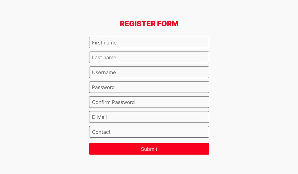
You can remove registration and authorization from the site altogether, but how do you identify customers in that case? As an option, you can either simplify the questionnaire form or use alternative forms of ordering products and services.
Flagship marketplaces such as Aliexpress, Amazon, and eBay provide a good example of registration on the marketplace. They use basic registration forms with the fields "Name", "E-mail", and "Password". All other data, including payment data, is entered by the user later or after the purchase.
The point is that complicated initial registration forms on the site discourage customers, and reducing the number of fields for data entry increases conversion rates.
An alternative option is to use existing credentials for authorization. For example, Google, Facebook, and other regional or global platforms' accounts. This really simplifies registration and improves the user experience.
If, on the other hand, you completely abandon site registration, there is a problem with user identification and, as a consequence, difficulties with logistics, payment, etc. But this can also be solved by external forms. For example, the Stripe payment system has several products for issuing invoices for payment on a dedicated page accessible through a personal link. Thus there is no need for registration, and the seller gets all the necessary information about the client from the completed receipt.
7. Excessive advertising
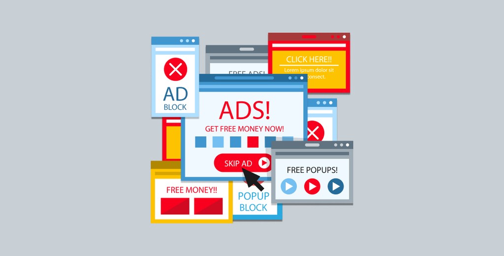
Advertising is a catalyst for scaling a business. It's also a headache for business owners, consumers, and web developers, reducing the average time spent navigating a website. In a marketing strategy, you need to know the measure and keep a balance, especially if you place banners on your site.
The first and key problem is the effect on performance. Ad banners are usually a statistical picture, a contrasting animation, or pop-up notifications. The latter is the most annoying, confirmed by thousands of complaints from users who have minimized the time visitors spend on the website.
Each type of marketing content has a certain "weight" that is downloaded and displayed through a connection to the server. This is especially true for promotional videos, which are a couple of tens of megabytes in size. Accordingly, it reduces both the total loading time of the site and its performance. We have described it in the first section of this material as well as its impact on conversion, which is also important.
The second problem is UX. There is a reason why hundreds of ad blockers have appeared on the market in recent years. It's not users who are so demanding because they don't want to look at marketers' creations. It's common sense. Often, important content is hidden behind pop-up notifications, and the usable page space is full of banners with important and valuable information.
Viewing such ads does not generate enthusiasm from potential customers, encouraging them to leave the resource as soon as possible. If anyone is to blame for this, it's the site owners who sacrifice user comfort in the pursuit of monetization.
Of course, to be fair, it is worth noting that there are sites that receive income only from advertising. But they have a properly built system for its placement, developed over the years, and the best specialists work on its optimization. If your platform's goals are different and you're not ready to analyze a stat on why people are leaving the site, get rid of advertising once and for all!
8. Intrusive media materials

Even in 2024, some people introduce automatic playback of video clips or music tracks on websites. On the one hand, this allows you to identify not the best resources, but on the other, it's really annoying. Especially if the user opens several tabs in a row, guess which one will close first without even looking at the content?
If we put aside the emotions aroused by such "refined" solutions, we can also discover the technical drawback of automatic content playback. Namely, its effect on the loading speed and slowness of the site.
As a rule, resource owners are not particularly carefully optimizing page code and do not prioritize loading components. Usually, multimedia files are miraculously launched before the main content. Users who leave a web page without viewing it are likely to have found themselves on such sites.
You can see a good example of automatic video playback in Meta, a Facebook product. In the app and on the site, the files are launched automatically. However, there is an option in the settings to turn off this feature and the sound playback, downloading via a mobile network.
In general, such customization allows company owners not only to optimize their digital resources but also to give the right of choice to users. And even with the abundance of advertising the platform displays, it has high conversion rates. Isn't that an example of inheriting experience?
9. Poor design

A website is the face of a brand. It's an axiom that can't be refuted. Site owners have just three seconds to capture visitors before they leave. From the first seconds of being on a digital resource, we form our own impression of the company. The e-commerce UI and UX design influence whether it will be positive or negative.
Let's be honest, many website owners ignore digital design and user experience trends, preferring to use original design that emphasizes brand value. Sometimes it looks funny, sometimes downright tasteless. Especially when all the page elements are made in screaming contrasting colors, burning out the sense of space for those who linger on the site for more than 15 seconds. Eventually, people leave without making a purchase.
And if author blogs or profile resources are forgiven for such tastelessness in design, then, for example, the e-commerce marketplace is not. Here the priority is given to sites with a neutral design, high loading speed, and simple and convenient architecture navigation. This is true both for desktop versions of platforms and for their mobile versions.
Indeed, it is from smartphones that people make the most purchases, although the conversion rate of sites is still higher on PCs: 5.06% vs. 2.49% for mobile devices. But there is nothing strange about this, and the reason for this difference is obvious.
Users search for the goods or services they need on smartphones but complete the purchase process on a PC. We can not say unequivocally that the reason for this poor mobile website design, because, as a rule, mobile responsive design is more convenient to use. But the fact remains.
10. Outdated content on the homepage and blog
This is a tricky reason. The fact is that search engines rank and index all the published materials on the site. That is, there is no useless content, especially if it is optimized according to the canons of SEO.
Another issue is the relevance of the data. The article for 2010 will remain irrelevant in 2024, no matter how many times the numbers and dates of editing are changed. But as for analytical materials or filling the site, there is room for maneuvering.
All text materials are indexed from 0 if less than 90% of the content remains the same. That is, the numbers can be changed without affecting indexing, but the effect of updating it will not.
The best way to keep the website up to date and delight users with relevant material is to create new content. In this case, you are not limited to the subject: profile research, industry news, events in the life of the company, and cases. You can and should publish it all by incorporating keywords and phrases.
Summarizing
If you have read to this point, we congratulate you. You are really interested in improving your web resource and are ready to invest in UX to increase website conversion. Indeed, the above factors impact business, its efficiency, and income.
Statistics collected from various sources indicate that in commerce and any other business, the user experience is crucial. Technical or marketing problems are solvable, and the costs are outweighed by increased revenue for the company. Ignoring them, on the contrary, exacerbates the situation and makes scaling the business virtually impossible, even in the long run.
Roobykon Software experts have been creating online marketplaces for over 13 years, considering all the necessary technical and marketing requirements. This allows our clients to confidently enter the market and take leading positions. Contact us if you are thinking about starting an online marketplace or are not sure your existing marketplace is compelling enough. Using our experience, we will offer you the best solutions to achieve your business goals!


